The 1980s Pastel Explosion: Memphis Design and Bold Contrasts
When you think of the 1980s, what comes to mind? For many, it's the Pastel Explosion, a design revolution driven by Memphis Design's bold contrasts and playful shapes. Spearheaded by Ettore Sottsass in Milan, this movement didn't just change furniture design but reshaped our entire approach to aesthetics. Its influence extends beyond interiors to music, fashion, and graphic design. Curious about how this lively, eclectic style became a cultural phenomenon and what it means for today's creative landscape? There's much more to uncover about its enduring legacy.
Understanding Memphis Design
Memphis Design emerged in the early 1980s and revolutionized the design world with its vibrant colors, unconventional geometric shapes, and bold patterns. Directly challenging the minimalist trends of previous decades, this movement sought to redefine design itself. Ettore Sottsass, along with a group of innovative designers in Milan, founded the Memphis Design movement with the aim of breaking away from traditional aesthetics.
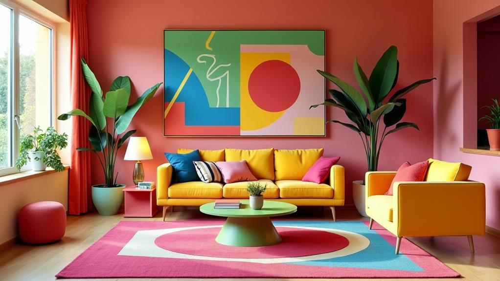
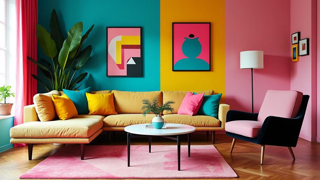
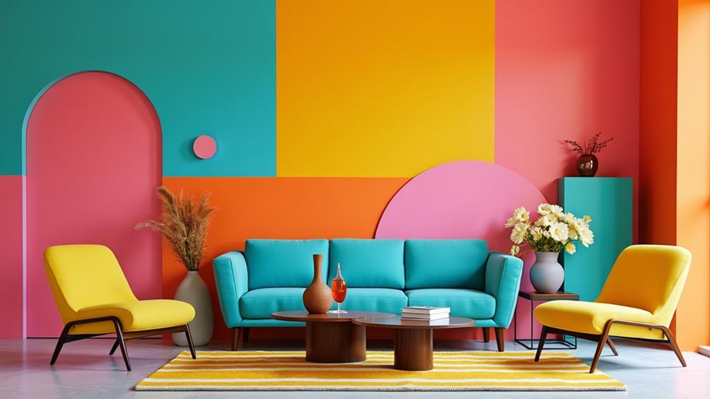
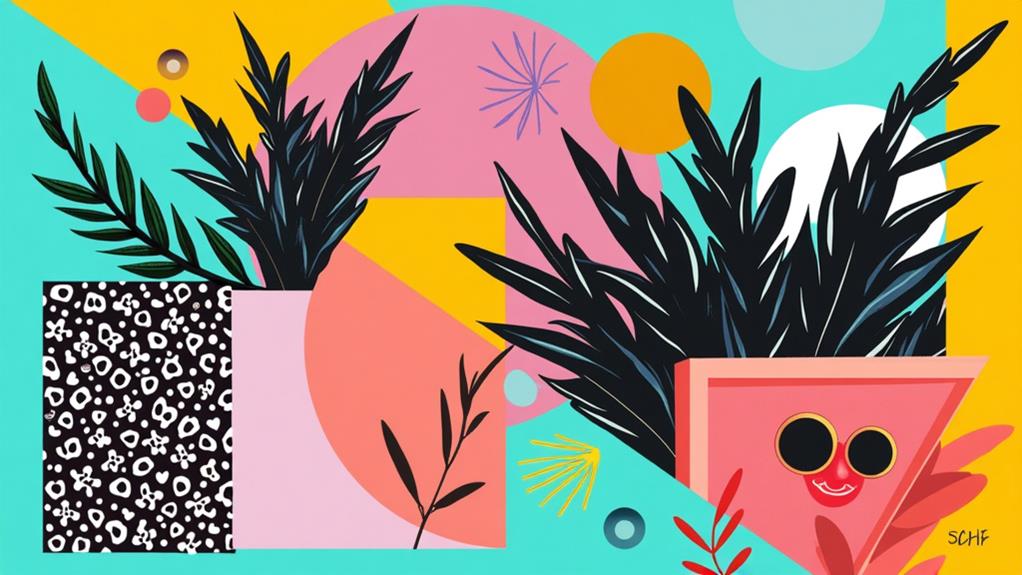
The Memphis Design aesthetic embraces the unexpected with its vivid color palette that often juxtaposes bright pinks, electric blues, and lively yellows. Geometric shapes are a hallmark, featuring asymmetrical lines, squiggles, and zigzags that defy conventional forms.
Materials like plastic laminate, often deemed kitschy, were used to create these daring designs, reflecting the movement's playful and rebellious spirit. Despite mixed reviews and commercial challenges, Memphis Design has left a lasting impact, continuing to inspire contemporary design, fashion, and art.
Origins and Evolution
Memphis Design originated in the early 1980s when a group of architects and designers, led by Ettore Sottsass, gathered in Milan. They aimed to challenge the prevailing minimalism by introducing bold, vibrant aesthetics, marking a radical reimagining of design norms.
Milan Gathering Genesis
In December 1980, a pivotal event in design history took place as 22 architects and designers gathered in Milan, Italy, to challenge the era's minimalist trends. This meeting marked the inception of the Memphis group, led by Ettore Sottsass. Inspired by Bob Dylan's song "Stuck Inside of Mobile with the Memphis Blues Again," the collective sought to create a new design style characterized by vivid colors and playful shapes.
The Memphis group's vision was defined by three key elements:
- Vivid Colors: They rejected the muted palettes of minimalism in favor of bright, bold hues.
- Playful Shapes: Their designs incorporated unconventional forms that defied traditional aesthetics.
- Emotional Provocation: Each piece was designed to evoke a strong emotional response.
Their groundbreaking work debuted at the Milan Furniture Fair in 1981, showcasing 55 distinct ornamental pieces. This exhibition underscored the group's commitment to eclectic and chaotic designs, which became synonymous with Memphis Design. Despite receiving mixed reviews and facing commercial challenges, the movement's boldness left a lasting impact on the design world. Even after the group's disbandment in 1988, the Memphis design style continues to be celebrated for its revolutionary approach that reshaped design paradigms.
Sottsass's Visionary Leadership
Ettore Sottsass, the visionary behind the Memphis Group, revolutionized design by breaking away from minimalist and midcentury-modern conventions. Founding the group in 1981 during a gathering of architects and designers in Milan, Italy, Sottsass sought to challenge the prevailing design norms. The group's name, inspired by Bob Dylan's song "Stuck Inside of Mobile with the Memphis Blues Again," reflected its playful and unconventional ethos.
Under Sottsass's leadership, the Memphis Group became renowned for its bold colors and geometric patterns. Sottsass emphasized emotional expression in design, resulting in eclectic furniture pieces that defied traditional aesthetics. The group's debut at the 1981 Milan Furniture Fair featured 55 ornamental pieces, garnering both acclaim and criticism and cementing its influence on the design world.
Although the Memphis Group disbanded in 1988, Sottsass's impact endures. His innovative leadership and the group's distinctive design style continue to inspire contemporary trends, demonstrating that bold colors and geometric patterns can redefine design boundaries.
Reaction Against Minimalism
Ettore Sottsass's visionary leadership set the stage for a significant shift in design philosophy, leading to the emergence of Memphis Design as a direct reaction against the minimalist trends of the 1960s and 1970s. While minimalism emphasized simplicity and neutrality, the Memphis Group, spearheaded by Sottsass, aimed to evoke emotional responses through bright colors and abstract shapes. Their playful and eclectic style often faced criticism for being in "bad taste," yet it boldly challenged the prevailing design norms.
The first major showcase of Memphis Design took place at the Milan Furniture Fair in 1981, featuring 55 pieces that defied the era's design conventions. The movement drew from diverse influences, including Art Deco, Pop Art, and kitsch, deliberately moving away from the austere lines and muted palettes of modernism.
Key Elements of Memphis Design's Reaction Against Minimalism:
- Bright Colors: In stark contrast to the neutral tones of minimalism, Memphis Design embraced vibrant colors to provoke emotional responses.
- Abstract Shapes: The use of unconventional forms added visual excitement and unpredictability.
- Playful and Eclectic Style: By combining various influences, Memphis Design celebrated individuality and creativity.
Despite initial commercial rejection, Memphis Design's legacy underscores its role as a crucial postmodern movement.
Key Characteristics

Memphis Design is characterized by its vibrant and contrasting color palette, featuring both pastel hues and bold shades for a lively visual impact. This movement thrives on bold contrasts and unconventional combinations, incorporating geometric shapes and playful forms that deviate from traditional lines and symmetry. The result is dynamic, visually stimulating designs.
| Key Characteristics | Description |
|---|---|
| Color Palette | Bright, clashing colors, including pastels and bold shades. |
| Shapes | Unconventional geometric shapes, emphasizing asymmetry. |
| Materials | Use of plastic laminate and terrazzo, adding a kitschy yet sophisticated look. |
| Patterns | Iconic patterns such as the Bacterio print, featuring abstract squiggles and chaotic designs. |
| Functionality | Emphasis on artistic expression and whimsy, resembling playful sculptures. |
Furniture and decor pieces in the Memphis style often utilize materials like plastic laminate and terrazzo, traditionally used for flooring, to achieve a kitschy yet sophisticated aesthetic. Iconic patterns, such as the Bacterio print with its abstract squiggles and chaotic designs, further contribute to the eclectic feel. Memphis Design challenges minimalism by prioritizing artistic expression and whimsy, making each piece resemble a playful sculpture rather than merely functional furniture.
Cultural Impact
In the 1980s, Memphis Design burst onto the cultural scene, aligning seamlessly with the vibrant aesthetic of the MTV generation. The Memphis movement quickly became a cultural phenomenon, influencing music videos, fashion, and graphic design. Its bold colors and playful patterns served as a dynamic rebellion against the austerity of the Reagan era, resonating deeply with youth culture eager for self-expression and individuality.
The Memphis Group's debut at the 1981 Milan Furniture Fair captivated audiences and garnered widespread media attention, securing its place in design history. Notable celebrities, such as David Bowie and Karl Lagerfeld, embraced the movement, with Bowie amassing over 400 pieces. This celebrity endorsement further cemented Memphis Design's status in popular culture, making it widely recognized.
Despite facing commercial challenges and disbanding in 1988, the Memphis movement left an indelible mark. Its legacy endures, inspiring contemporary designers and sparking renewed interest through exhibitions and collaborations in the 2000s.
Key Points of Cultural Impact:
- Influenced music videos, fashion, and graphic design.
- Symbolized rebellion and individuality in youth culture.
- Gained celebrity endorsements, enhancing its cultural footprint.
Modern Applications
The cultural impact of Memphis Design in the 1980s set a bold precedent, and its influence persists in the modern era. Its lively color palettes and chaotic shapes are prominently used in branding to create memorable visual identities. By leveraging bold patterns and geometric elements, companies can stand out in competitive markets.
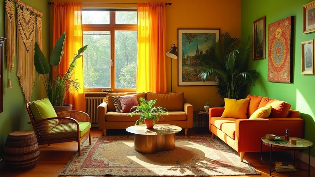
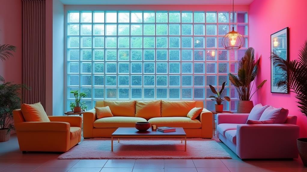
In interior design, Memphis principles add a playful touch to contemporary spaces. Statement furniture pieces like coffee tables and stools often feature bold patterns and asymmetrical forms, making them eye-catching focal points in any room. These elements infuse a sense of whimsy and energy that's hard to ignore.
Graphic design also benefits from the Memphis aesthetic, particularly in digital spaces. Whether you're designing marketing materials or social media content, incorporating Memphis Design elements can enhance visual impact. Techniques such as Background Memphis Design and Miniature Memphis Design allow for creative expression while maintaining a cohesive look.
The evolution of Organic Memphis Design shows a shift towards softer, flowing shapes, demonstrating the adaptability of the original Memphis aesthetic. This modern take retains its playful spirit, making it versatile for various design applications today.
Color Theory and Usage
Exploring Memphis Design reveals bold color contrasts and a thorough understanding of color properties such as hue, tone, temperature, and brightness, which together create a striking visual impact. This distinctive use of colors diverges from the muted palettes of earlier decades, infusing each piece with energy and excitement. By employing bright, clashing colors, Memphis Design embodies rebellion and individuality, mirroring a broader cultural movement.
Understanding Color Properties
Immerse yourself in the fascinating world of color theory, where understanding the nuances of hue, tone, temperature, and brightness can transform your designs. Mastering these color properties allows you to create a vibrant visual language that captivates and communicates effectively. In Memphis Design, bold colors are pivotal, challenging conventional aesthetics and embracing a whimsical design ethos.
Let's explore the core elements of color theory:
- Hue: The specific name of a color, such as red or blue. Hues are the building blocks of your palette, setting the overall mood of your design.
- Tone: The lightness or darkness of a color. Adjusting tones can significantly influence the ambiance, making your design feel either more lively or more subdued.
- Temperature: Colors are classified as warm (reds, oranges) or cool (blues, greens). Warm colors evoke energy and excitement, while cool colors promote calmness and tranquility.
Incorporating these elements enables you to craft designs that are not only visually appealing but also emotionally impactful. The Memphis Design movement exemplifies this by blending bright, contrasting hues in ways that convey a sense of playfulness and artistic expression.
Bold Color Contrasts
Bold color contrasts are a hallmark of Memphis Design, captivating viewers with their vibrant energy and unapologetic brilliance. Departing from the muted tones of earlier design movements, Memphis designers embraced lively hues to evoke high energy and a playful aesthetic. These bold contrasts were not merely for visual impact; they were deeply rooted in color theory, leveraging the psychological effects of colors to elicit emotional responses and create dynamic visual experiences.
Memphis designers frequently employed unexpected color combinations, pairing bright yellows with deep blues or hot pinks with rich greens. These choices challenged traditional notions of color harmony, introducing an element of surprise and delight. The practice of color blocking further enhanced visual intrigue by juxtaposing distinct color areas to produce a striking effect.
| Bold Color Contrasts | Memphis Designers | Chaotic Patterns |
|---|---|---|
| Bright yellows | Ettore Sottsass | Abstract shapes |
| Deep blues | Michele De Lucchi | Zig-zags |
| Hot pinks | Nathalie Du Pasquier | Geometric forms |
| Rich greens | George Sowden | Polka dots |
The chaotic patterns and bold colors of Memphis Design reflected the broader cultural shift of the 1980s, celebrating individual expression and creativity over conventional design norms. By incorporating these elements, Memphis Design redefined aesthetic boundaries and left an enduring impact on the design world.
Typography in Memphis Design
Memphis Design is renowned for its bold color palettes and chaotic patterns, and its typography plays an equally crucial role in defining the movement's playful spirit. Typography in Memphis Design often favored informal, handwritten fonts, prioritizing aesthetics over legibility. This choice perfectly aligns with the playful nature of the movement, offering a visual impact that complements the bold colors and chaotic patterns.
Designers frequently disregarded traditional legibility conventions to create visually stimulating typography. They used contrasting colors to enhance the design's liveliness and set a striking visual tone. Typography was not merely a functional element but a creative tool for Memphis designers, enabling them to experiment with:
- Scale: Oversized letters were commonplace, adding dramatic flair.
- Orientation: Text was often arranged unconventionally, challenging the viewer's expectations.
- Composition: Creative layouts elevated the design's artistic value, contributing to its narrative.
In Memphis Design, typography wasn't just about conveying a message; it was an integral part of the design's artistry. The bold contrasts and experimental nature of the typography mirrored the movement's ethos of lively expression, making every piece a visual adventure.
Challenges and Considerations
Navigating the realm of Memphis Design presents unique challenges that require thoughtful consideration. Overusing its elements can quickly lead to visual chaos, making a solid grasp of color theory and composition essential. Balancing bold patterns and lively colors without overwhelming the viewer demands a precise understanding of how different hues and shapes interact.
The inherent boldness of Memphis Design can be polarizing. While some audiences appreciate its eccentricity and playful charm, others might find it overwhelming or outdated. Therefore, it's crucial to carefully consider your target demographic. Misjudging this can alienate your audience rather than engage them.
Collaborating with professional designers can significantly enhance your approach. Their expertise can help you navigate the complexities of color, shape, and layout, ensuring that your design is both striking and cohesive. Successful implementation requires a mindful balance between nostalgia and contemporary relevance. Careless execution can strip away the intended playful charm, turning it into a disjointed mess.
Community engagement is another valuable tool. Participating in newsletters and design contests fosters collaboration and knowledge sharing, providing insights into best practices and creative approaches. This collective wisdom can guide you in effectively applying Memphis elements.
Related posts