The 1960s Love for Bold, Primary Colors in Home Decor
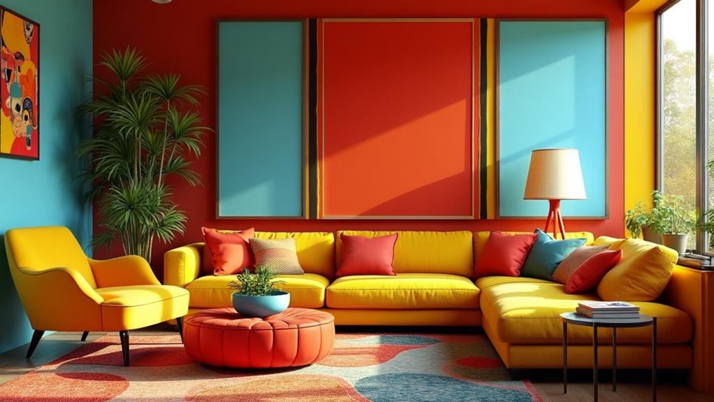
When you think of the 1960s, bold primary colors in home decor likely come to mind, reflecting the decade's cultural shifts and youthful energy. Bright oranges, avocado greens, and fuchsias weren't just popular—they were statements of individuality and rebellion against the subdued palettes of previous periods. These lively hues permeated every aspect of interior design, from geometric patterns on wallpaper to psychedelic motifs on textiles. This audacious use of color not only defined the homes of that era but also influenced future design trends, making a lasting impact on the aesthetic principles of interior design.
The Shift to Bold Colors
In the 1960s, home decor underwent a lively transformation as the pastel shades of earlier decades gave way to bold, daring colors like orange, avocado green, and warm yellow. This dramatic shift in interior design was more than aesthetic; it reflected the cultural upheaval and counterculture movements of the time.
Pop culture played a significant role in bringing these bold colors to the forefront. Acidic tones like magenta and pea green became symbols of youth culture and social justice. These vivid hues allowed for more expressive and eclectic home decor, breaking free from the restrained designs of previous decades. Living rooms often featured bold wallpaper designs with geometric patterns and psychedelic motifs, creating colorful, energetic environments.
Furniture and decor items showcased mismatched patterns and bright primary colors, promoting a playful and informal style. This approach celebrated individuality and self-expression, key themes of the 1960s. The Memphis design movement of the 1980s later drew heavily from these 1960s trends, cementing the decade's legacy in bold color choices.
Key Colors of the 1960s
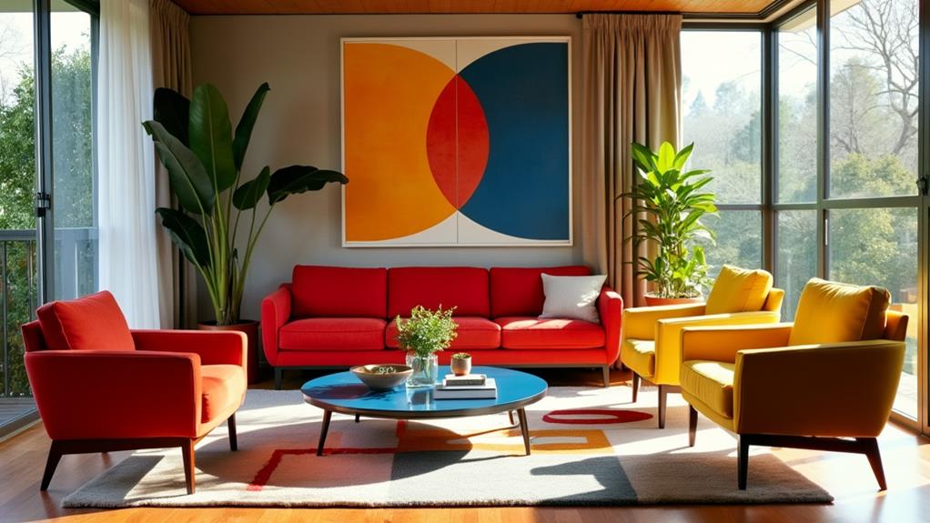
Bold colors and daring patterns defined 1960s home decor, with specific hues standing out as emblematic of the decade. Primary colors like red, yellow, and blue were foundational, creating dynamic and lively interiors that captured the era's spirit. These hues weren't just for accents; entire rooms often featured these vibrant shades.
In addition to primary colors, other bold hues like bright orange and avocado green gained popularity, reflecting the energetic and youthful spirit of the time. These colors brought a fresh and invigorating feel to spaces, making the decor unmistakably 1960s.
To encapsulate the essence of 1960s home decor, consider these key color trends:
- Primary Colors: Red, yellow, and blue were central to many 60s interiors.
- Bold Hues: Bright orange and avocado green became iconic, adding zest and energy.
- Playful Accents: Fuchsia and hot pink, often paired with lighter pinks, offered a playful touch.
Metallic tones like copper and gold were also incorporated, adding a glamorous and lively feel to the overall decor. Embrace these bold colors to relive the dynamic and lively essence of 1960s home design.
The Influence of Pop Art
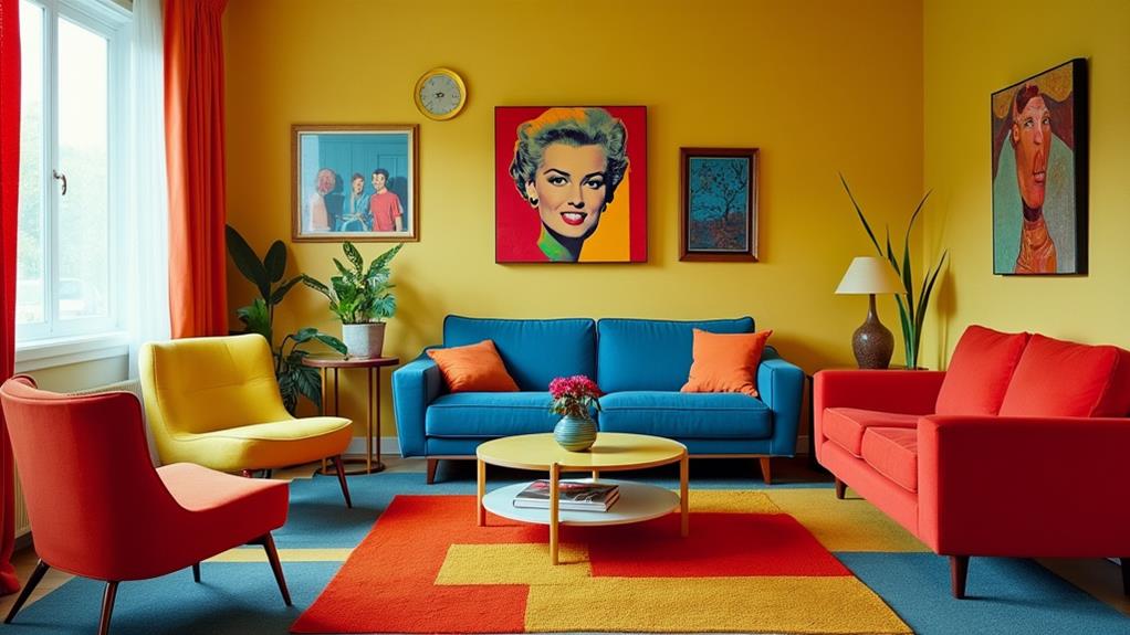
To discuss 1960s home decor is to acknowledge the profound impact of Pop Art. With its vibrant colors and whimsical designs, artists such as Andy Warhol and Roy Lichtenstein inspired homeowners to integrate art into their living environments. This era's decor celebrated everyday objects and mass media imagery, infusing rooms with primary colors and bold patterns.
Vibrant Color Explosion
Amid the transformative energy of the 1960s, home decor underwent a vibrant color explosion influenced by Pop Art. Bold primary colors—red, blue, and yellow—saturated interior design, reflecting the era's youthful energy and optimism. Bright oranges, magentas, and pea greens became staples, infusing living spaces with vibrancy and visual stimulation.
This departure from the muted tones of previous decades was a deliberate statement of individuality and defiance against conventional norms. The bold use of primary colors extended beyond furniture and textiles to walls, accessories, and even kitchen appliances, embracing this colorful revolution.
Here are three ways this dynamic color explosion made its mark:
- Walls and Paint: Entire rooms were painted in bright, bold colors, creating an energetic ambiance.
- Furniture: Chairs, sofas, and tables featured primary colors, adding a playful element.
- Accessories: Lamps, rugs, and artwork incorporated vivid hues, unifying the room's aesthetic.
Art Meets Design
The 1960s home decor scene witnessed a transformative blend of art and design, deeply influenced by the Pop Art movement. Bold, vibrant colors dominated, reflecting the era's fascination with consumer culture and everyday objects. Artists like Andy Warhol and Roy Lichtenstein popularized primary colors—red, blue, and yellow—which quickly permeated interior design.
Imagine stepping into a room where walls are covered with repetitive patterns and graphic designs inspired by Pop Art. Wallpaper and upholstery trends borrowed heavily from these artistic elements, creating visually stimulating environments that were both playful and daring. Brightly colored furniture became iconic, often featuring exaggerated forms that mirrored the whimsical nature of Pop Art.
In this era, art transcended its traditional confines, becoming an integral part of walls, furniture, and decor. Living spaces celebrated mass culture, encouraging individual expression through bold color choices. The 1960s were all about breaking the mold, and the fusion of art and design in home decor epitomized that spirit.
Popular Patterns and Textiles
The 1960s home decor scene was a vibrant playground for creativity and self-expression, characterized by bold primary colors and lively counterculture influences. Patterns were anything but shy, featuring geometric shapes and psychedelic designs that mirrored the spirited ethos of the time. Textiles played a pivotal role, often showcasing mismatched floral patterns alongside stripes, emphasizing the era's preference for bold and lively designs.
Synthetic fabrics like vinyl and nylon were prevalent, making it easy to produce and maintain those bright, bold patterns. Upholstered furniture often featured graphic prints in striking colors like orange, avocado green, and fuchsia, capturing the youthful, energetic vibe of the decade.
To create a cohesive '60s-inspired space, consider the following elements:
- Wallpaper: Opt for iconic designs with large-scale prints and vivid hues to transform any room into a visually stimulating environment.
- Textiles: Choose lively, mismatched patterns to add a touch of retro flair.
- Color Palette: Embrace bold primary colors to stay true to the period's aesthetic.
Iconic 1960s Furniture
Discussing 1960s home decor inevitably brings up the era's iconic furniture, characterized by bold, primary colors and lively shades that captured the youthful energy and self-expression of the time. Bright reds, yellows, and blues were prevalent, creating a spirited atmosphere in living spaces.
Iconic 1960s furniture often featured modular designs, allowing for customizable configurations to suit various moods or spatial needs. This versatility was practical and added a playful element to home decor. Designers like Charles and Ray Eames were pioneers, introducing molded plastic chairs in striking colors, including the famed Eames Lounge Chair, which balanced comfort with bold design.
Upholstered furniture received a vibrant update with psychedelic patterns and mismatched prints, reflecting the counterculture movement's celebration of individuality and creativity. Concurrently, Scandinavian influences brought sleek lines and functional forms into the mix. When combined with bold color palettes, these pieces made a strong, stylish statement in any room.
Color in Different Rooms
In 1960s homes, each room featured distinct color schemes to set the mood. Living rooms showcased lively palettes, bedrooms made bold statements with deep hues, and kitchens flaunted retro flair with playful shades like avocado green and harvest gold.
Living Room Vibrant Palettes
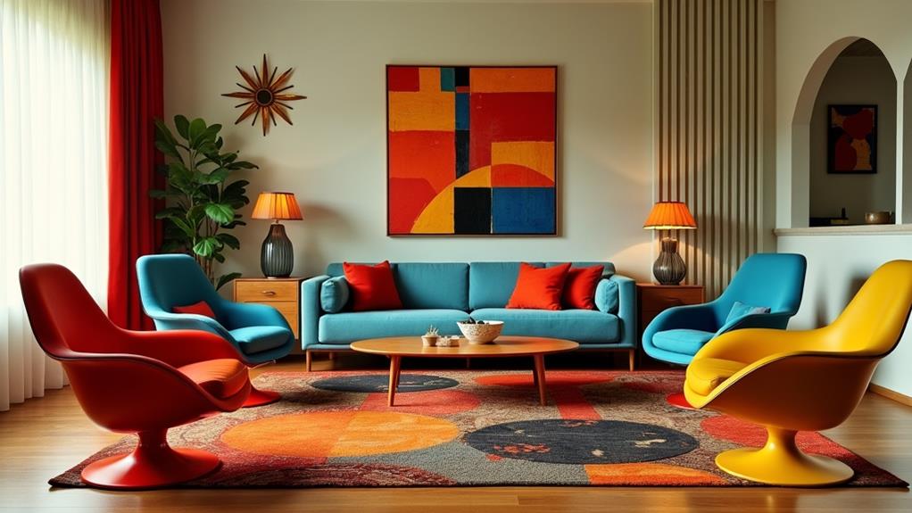
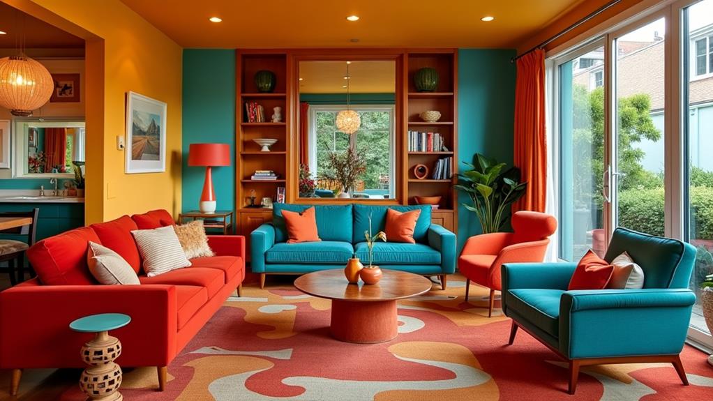
During the 1960s, living rooms came alive with vibrant palettes that reflected the era's dynamic cultural changes and youthful energy. Bold primary colors like red, yellow, and blue dominated, creating a striking visual impact. These vivid palettes extended to every aspect of the living room, from accent pieces to larger furniture items.
- Accent Pieces: Bright cushions, eclectic rugs, and quirky vases in shades like fuchsia and avocado green provided eye-catching contrasts against lighter backgrounds, making each piece a statement.
- Neon Colors: Neon hues were immensely popular, adding a playful energy to living spaces. Neon cushions, wall art, and lighting fixtures contributed to an electric vibe that was hard to ignore.
- Mismatched Patterns: Floral and geometric designs coexisted, encouraging self-expression and creativity. Mixing patterns was common, with a more varied approach being better.
Iconic pieces such as modular sofas and oversized lamps in eye-catching colors served as focal points, encapsulating the vivid 1960s living room aesthetic.
Bedroom Bold Statements
Bedrooms in the 1960s made bold statements with lively hues and eclectic decor, creating spaces bursting with personality. Bright colors like red, yellow, and blue reflected the vibrant culture of the decade. Accent walls in deep hues such as navy or avocado green added depth and sophistication while remaining trendy.
Furniture in eye-catching shades like fuchsia or turquoise served as focal points, embracing maximalist design. Textiles played a crucial role, with bedding and curtains often featuring mismatched patterns and vibrant colors, allowing for personal expression and making each bedroom unique.
To enhance the room's glamour, metallic tones were paired with primary colors, drawing inspiration from discotheques and pop culture. Here's a summary of these elements:
| Element | Description |
|---|---|
| Bold Colors | Bright reds, yellows, and blues |
| Accent Walls | Deep hues like navy and avocado green |
| Furniture | Fuchsia, turquoise as focal points |
| Textiles | Mismatched patterns, bright colors in bedding |
This approach ensured each bedroom was a unique reflection of its occupant's personality and the era's energetic spirit.
Kitchen Retro Flair
Stepping into a 1960s kitchen, you are instantly greeted by vibrant colors and playful patterns that perfectly capture the era's retro flair. The decade's affinity for bold colors is evident in every detail, from kitchen cabinets to the dazzling appliances. Here's what you can expect:
- Bold Colors: Kitchens of the 1960s were awash with hues like avocado green, mustard yellow, and fiery orange, reflecting the energetic spirit of the time.
- Primary Colors: Red, yellow, and blue were often used in furnishings and accessories, creating a cheerful and lively atmosphere, making cooking and dining a vibrant experience.
- Retro Styles: Iconic shades like turquoise and hot pink adorned appliances, transforming everyday items into standout focal points.
Floral wallpaper patterns and mismatched designs amplified the playful and eclectic spirit. Colorful Formica countertops and brightly painted kitchen cabinets were standard features, marking a stark departure from the muted tones of previous decades. By embracing such dynamic and expressive decor, 1960s kitchens became spaces where creativity and boldness thrived. To infuse your kitchen with retro flair, look no further than the vivid and dynamic colors of the 1960s.
Lasting Impact on Design
The bold color choices of the 1960s—reds, yellows, blues, avocado greens, and burnt oranges—did more than just brighten homes; they transformed interior design. These vibrant, primary colors reflected the era's cultural upheaval and youthful spirit, making a lasting impact on home design that continues to influence modern aesthetics.
During the 1960s, bright colors like avocado green and burnt orange became staples in kitchens and living spaces. The era's lively and energetic lifestyle was mirrored in these striking color combinations, often seen in statement pieces and accent walls. The popularity of psychedelic art and pop culture pushed designers to explore bold palettes, leading to groundbreaking home designs.
The Memphis design movement further popularized the use of electric colors in furniture and decor, redefining traditional aesthetics. This legacy remains evident in contemporary designs, where inspiration is frequently drawn from the playful patterns and bold palettes of the 1960s.
| 1960s Color | Usage | Mood |
|---|---|---|
| Red | Accent Walls | Energetic |
| Yellow | Kitchens | Cheerful |
| Blue | Living Rooms | Calm |
| Avocado Green | Appliances | Retro |
| Burnt Orange | Furniture | Warm |
These colors continue to emphasize individuality and self-expression in modern home design.